I started this project because i had to study for my final exam of mathematical analysis. I usually make big cheat sheets on paper with all the formulas and a summary of the concepts. But since this year I’ve been trying to make everything digital and keep no papers. Partly because i don’t really want to keep around all those papers but mostly because because the flexibility of a keyboard and a graphics tablet is unbeatable by paper. One of those advantages is the capacity to feed my notes into software to do stuff.
I decided to write my notes in a markdown file with the following structure:
# [Title]
## [Concept]
[Some text]
[Even Latex math]
### [Any subtitle]
### Utiliza:
- [Related concept 1]
- [Related concept 2]
## [Concept]
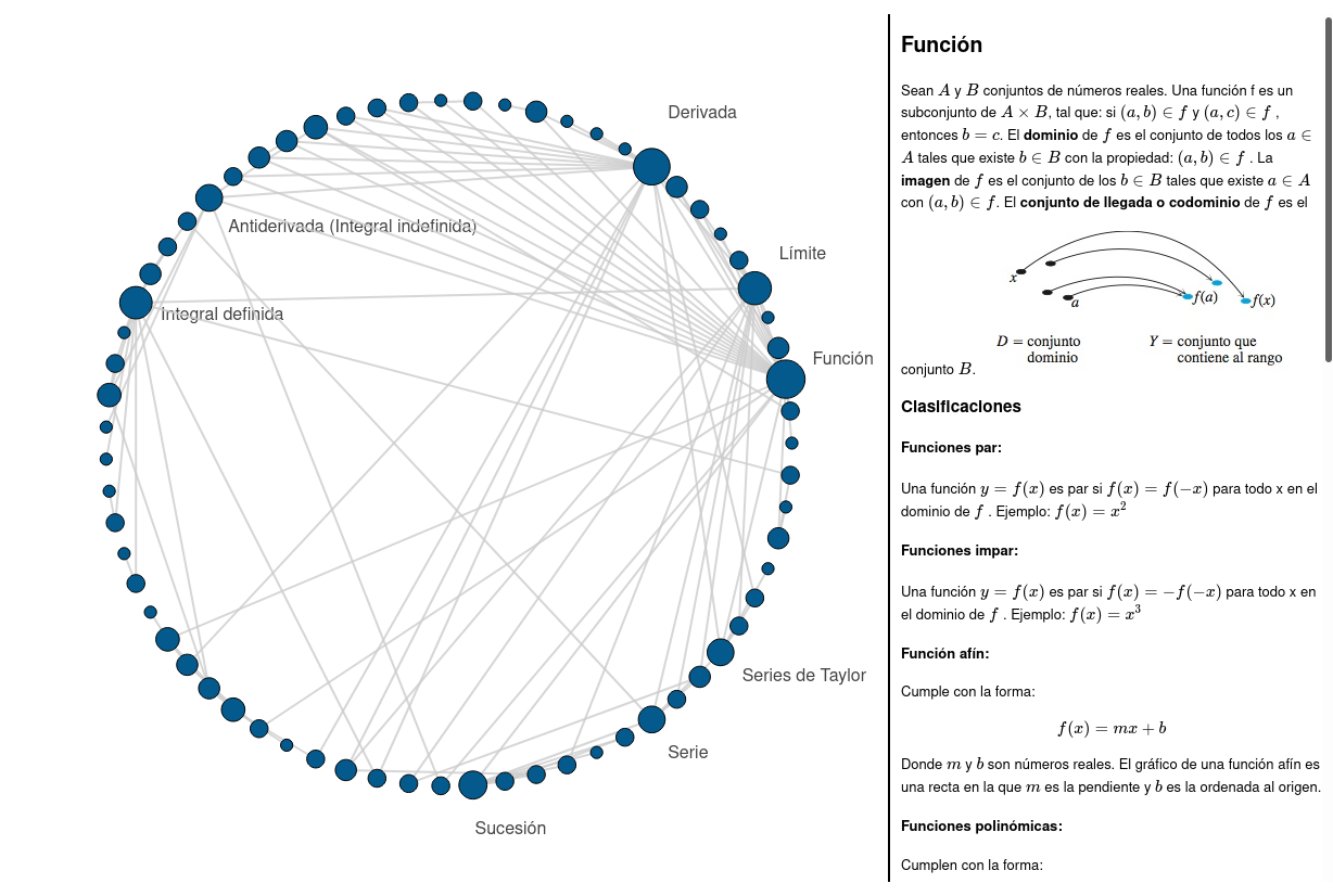
Where i separated the whole topic into concepts and noted at the end of each concept section the concepts on which it relied.
Then i wrote a simple python script to parse the file and place the concepts as connected nodes in a NetworkX graph, using the connections established in the markdown file.
Since just having a graph object in my computer’s memory was not very helpful to me i went looking for an interesting way to plot the data. Matplotlib seemed a bit limited, i wanted something interactive, so after looking at the available interactive plotting libraries i settled for Bokeh, as it seemed easy to use and had some examples similar to what i wanted to do.
After a couple of days figuring out how everything worked, i managed to learn enough to make something a simple plot that showed all the nodes connections in a pretty manner. Then the biggest struggle was showing the information associated with the nodes. Using hover labels i could show basic info, like the amount of connected nodes for each node, but no markdown and Latex equations.
So after a whole day of reading the docs a i learned how to extend the library through scripts. The Bokeh library outputs plots as html files, so it leaves the possibility to the user to add javascript, css and to export only certain elements to insert them into an html template.
Knowing all that I added a script that, on the selection of a node, assigned the content of an html div to the content of the node and used Katex to format the math.
And that was all, I had an interactive cheatsheet to keep studying for my exams. In the future i may come back to this project to make it more generalized and mobile friendly.
Update (2020-12-29).
Now the graph resizes responsively, so it can be viewed on mobile devices and screens of all sizes.
Also, the code was reworked and reorganized and can now be used as a command line tool for easily creating HTML files containing the graphs.
(To access a demostration click on Demo at the top of the post)